Radarblock
timeline
3 Months
Introduction
The essence of their brand is around the idea that “Radar is everywhere.” They operate like a radar, constantly spotting emerging projects, trends, and narratives to be shaped.

To bring Radar to life, they needed a brand and visual language that felt just as bold, strong, and unmistakable as their instinct for discovery.

Initial logo concepts & iterations

Initial logo concepts & iterations


Their presence in crypto marketing, GTM and events is bold and assertive, and the brand needed a color that could express that same confidence.

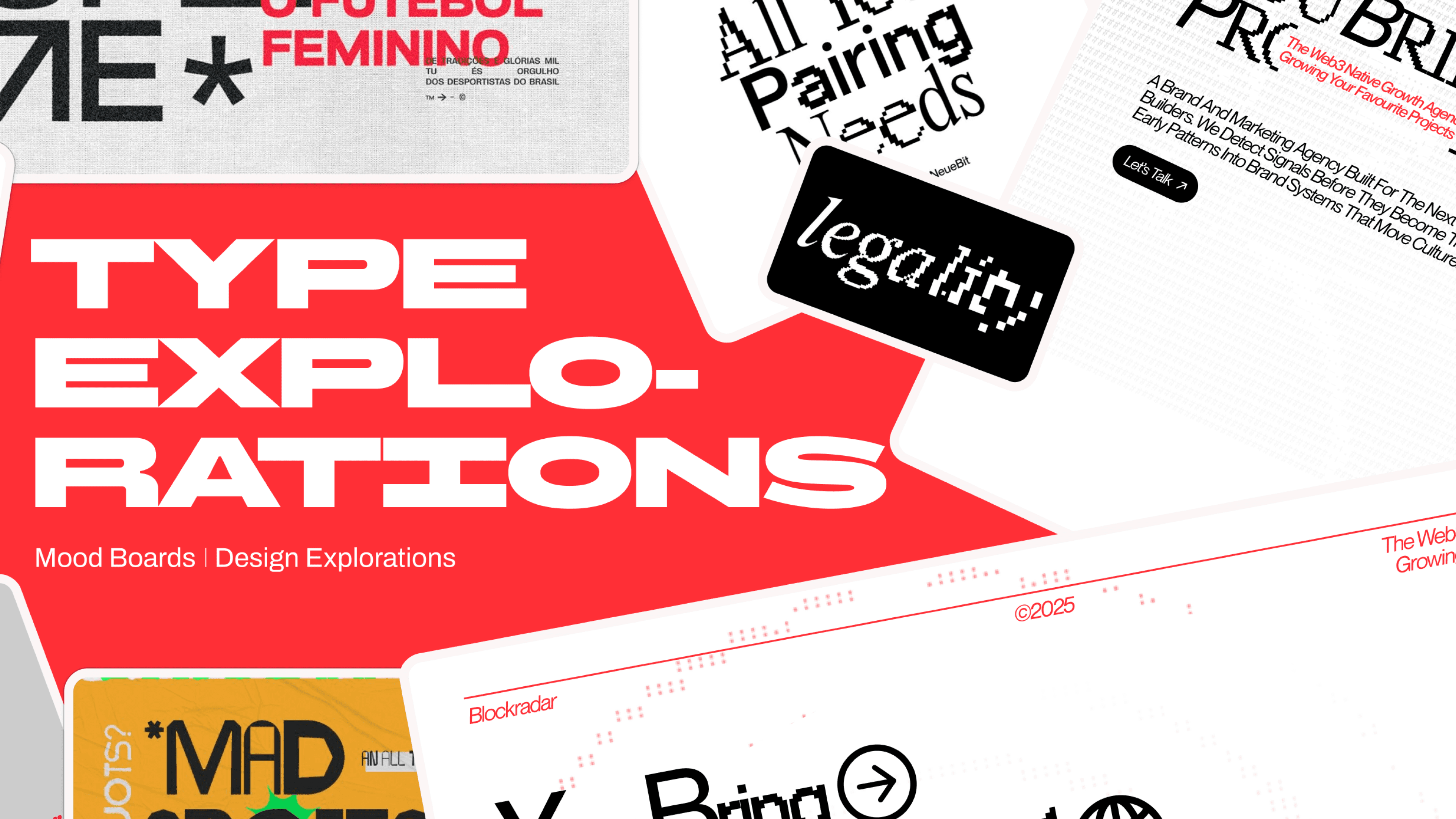
Modernist and brutalist poster design became the reference point, and BBH Sans fit the vision perfectly. Its stable, heavy forms feel confident, while still keeping a professional tone. It is versatile enough to flow across every brand touchpoint without losing character.

Brand DNA & Research
When we studied the landscape, most crypto marketing agencies fell into two extremes: overly corporate and muted, or chaotic and visually loud. Radarblock didn’t belong in either category. Their work sits at the intersection of instinct and structure. The radar metaphor became the functional core of the identity. That behaviour shaped the system: strong contrast, focused use of red, structured grids, and pixel-based textures that suggest signal transmission without overwhelming the layout.

Initial logo concepts & iterations

Initial logo concepts & iterations

Initial logo concepts & iterations

Initial logo concepts & iterations
Brand Elements
The imagery uses a pixelated, dithered treatment that brings in a sense of signal, noise and transmission. It feels digital, raw and slightly imperfect in a way that mirrors how early trends first appear: scattered, grainy and only clear to those who know how to read them. The background patterns carry this idea forward through wave and ripple formations. These are directly inspired by radar scans, creating a sense of motion and expansion. This is paired with a secondary grid-like pattern. To tie it together, custom icons break the heaviness of the type and add playful cues that guide the eye across the layout.


Conversion Rate
14.5x
Raised
$3.4M
Twitter Growth


