Coins.me

timeline
3 Months
Introduction
What started as making DeFi accessible has grown into an all-inclusive solution that makes buying and selling crypto as smooth as mobile payments - letting anyone convert between local currency and crypto as simply as booking an Uber.

DESIGN transparent experience where anyone can buy and sell crypto gas-free, fast, and private, transforming complex crypto trading into simple everyday transactions.
The Logo
We began exploring concepts that reflected crypto's energy and growth — experimenting with patterns and symbols that suggest the expansive nature of financial markets. We finally decided to capture the platform's core mission: simplicity over complexity. Taking inspiration from Base's "trendy and simple" aesthetic, we added a subtle 3D blue dot as the connector between "coins" and "me," replacing the traditional period with something more dimensional.
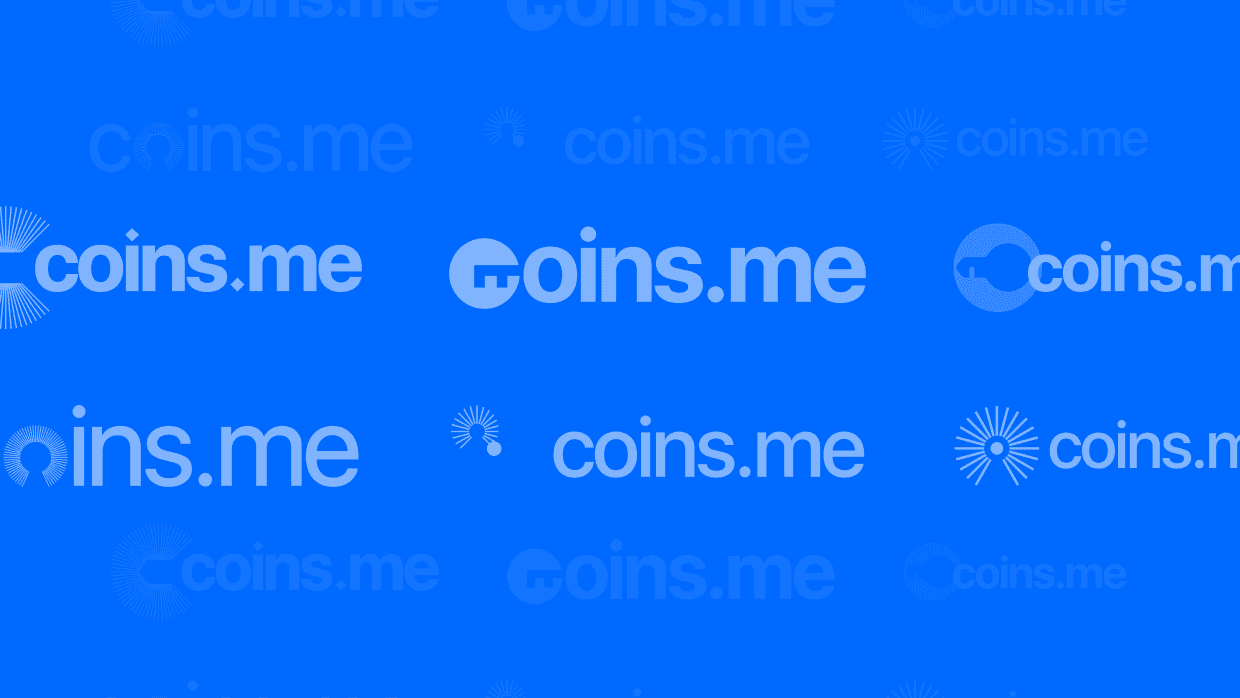
Initial logo concepts & iterations

Initial logo concepts & iterations

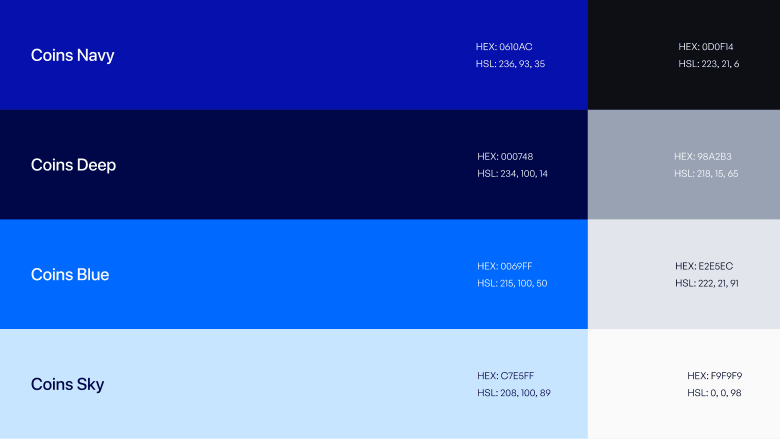
We developed a thoughtful blue-focused palette that feels reliable yet inviting. The primary blue shows trust and credibility, while gentler tones create hierarchy and ensure the platform feels welcoming

We chose Inter for its clean, modern feel that perfectly matches the vision of "professional and cool" while balancing the "trendy and simple" aesthetic.

Brand DNA // Research
But here's what we realised that people wanted to transact through flows they already knew—GPay-style simplicity, step-by-step transparency, instant access without the ritual of traditional exchange KYC marathons. So we constructed Coins.me's entire brand around this insight. Every piece of their identity became about simplicity that doesn't break security: KYC-free trading up to meaningful limits, gamified verification that actually feels engaging, and zero-knowledge privacy that keeps personal details locked down while legitimate transactions flow freely.

Initial logo concepts & iterations

Initial logo concepts & iterations

Initial logo concepts & iterations

Initial logo concepts & iterations
Brand Elements
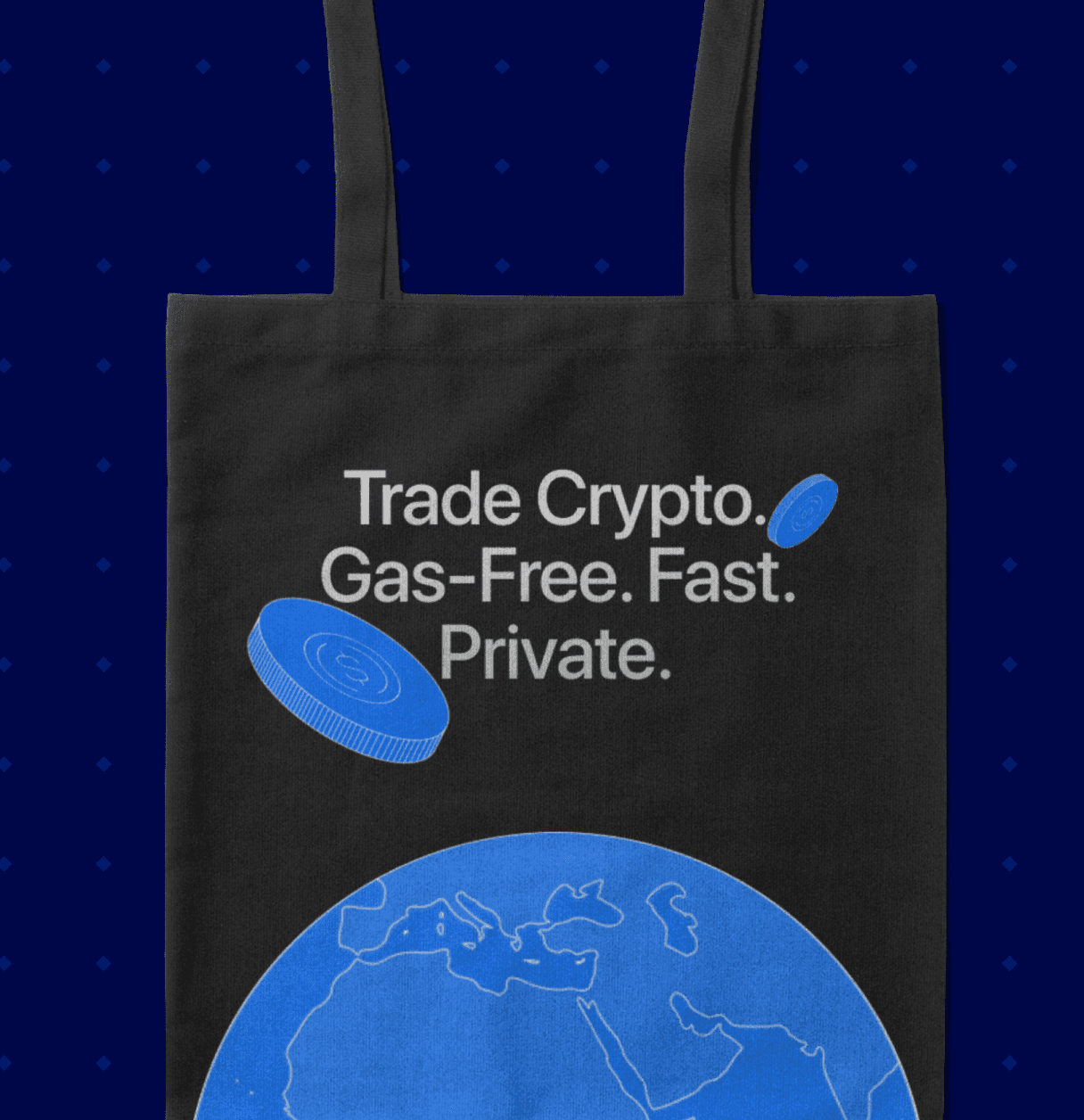
We explored thin stroke styles that felt quick, directional, and full of movement. That same thinking extended into the illustration style. We worked with three line types as the base — stacked lines to represent intentional movement (a visual cue for a catalyst), angled lines to suggest change, and straight, closely spaced lines to convey simplicity.




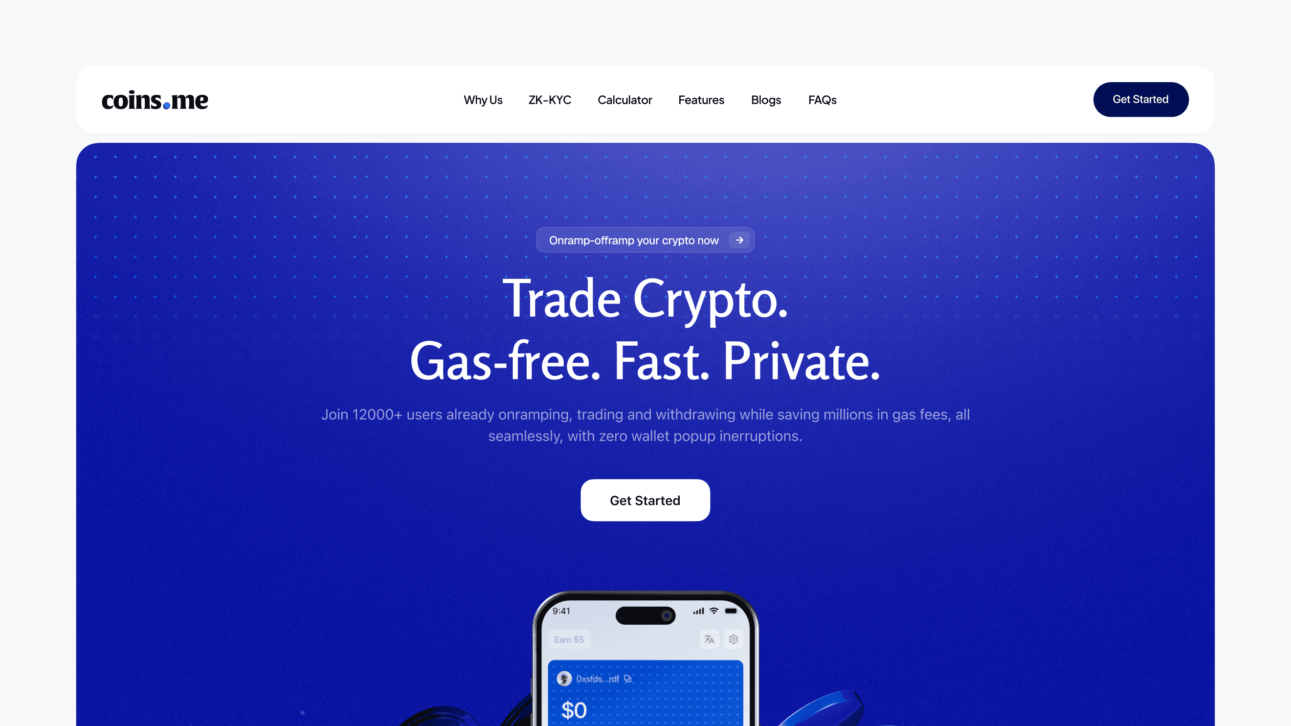
Landing Page
Our priorities were simple, clear information flow and streamlined user journeys, knowing that our target users needed confidence more than visual excitement. The consistent use of rounded corners, gentle shadows, and the prominent circular coin was to create a cohesive system that feels safely technical and friendly.

Conversion Rate
14.5x
Raised
$3.4M
Twitter Growth


