Catalysis

timeline
3 Months

StoryLike
We narrowed it down to a mark that captured three key ideas: a pathway, an arrow, and forward momentum. Much like how Catalysis unifies security abstraction, we brought those values together into a single, unified symbol.

Initial logo concepts & iterations

Initial logo concepts & iterations


We chose a blend of warm, inviting hues — a contrast to the usual cold tones in tech, making the brand feel more approachable and human.

Satoshi as a font feels demure — but knows how to hold its ground. It has a bold presence, yet stays friendly thanks to its soft curves and subtle accents.

Brand DNA // Research
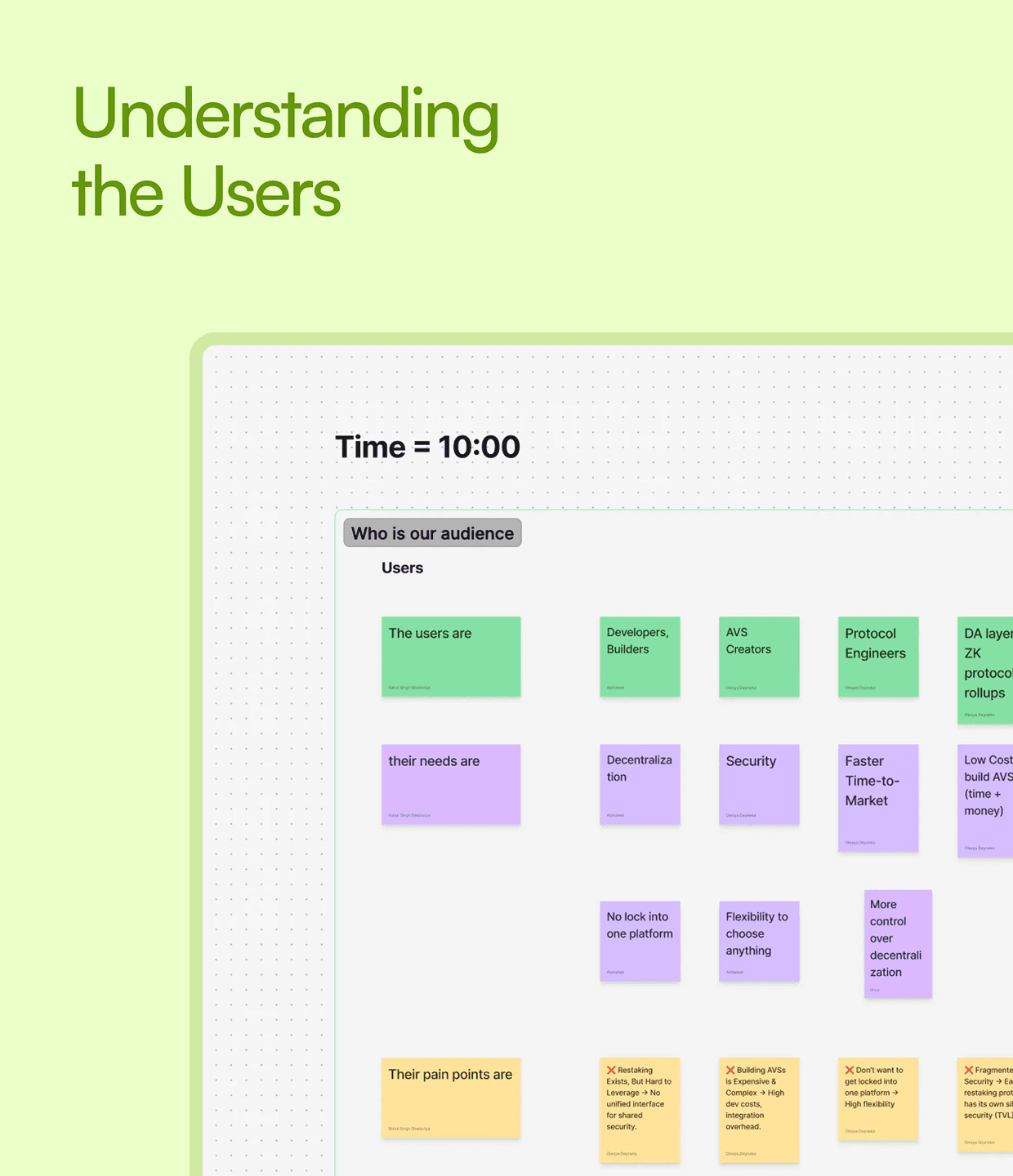
We also spent time looking at how users interact with similar products. What clicks, what confuses, what sticks. All of that feeds into building a brand that feels familiar, trustworthy and easy to grasp.

Initial logo concepts & iterations

Initial logo concepts & iterations
Initial logo concepts & iterations

Initial logo concepts & iterations
Brand Elements
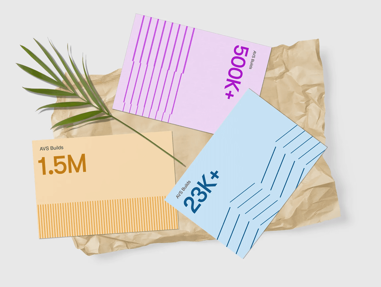
We explored thin stroke styles that felt quick, directional, and full of movement. That same thinking extended into the illustration style. We worked with three line types as the base — stacked lines to represent intentional movement (a visual cue for a catalyst), angled lines to suggest change, and straight, closely spaced lines to convey simplicity.



Landing Page
We also tried more compact, boxed layouts using rigid line structures to lean into a tech-forward aesthetic. Ultimately, we chose an open, fluid approach that felt more aligned with the brand. The final direction uses a mix of stacked, compact, and directional lines — forming the animated header pattern that sets the tone for the website. Throughout the landing page, we incorporated subtle, smooth animations to maintain consistency with the overall brand identity.


Conclusion
The final direction uses a mix of stacked, compact, and directional lines, forming the animated header pattern that sets the tone for the website. Throughout the landing page, we incorporated subtle, smooth animations to maintain consistency with the overall brand identity.
Conversion Rate
14.5x
Raised
$3.4M
Twitter Growth


