Botanix Labs

timeline
3 months
Introduction
The goal was an experience people wanted to return to on their own, something with enough texture and reward to feel less like onboarding and more like a place. That thinking became 2100: A World on Bitcoin, a gamified city built entirely around the Botanix Mainnet, where users move between partner dApps, complete quests, and earn rewards inside a world instead of a checklist.
StoryLike
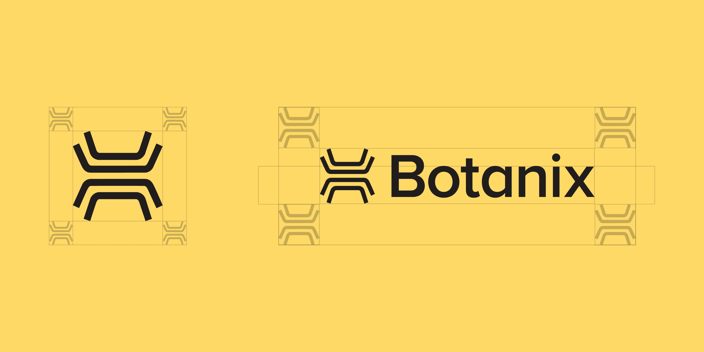
Every stroke in the symbol is symmetrical for a reason. Legs brace outward and pull back into one closed form, the same way independent operators hold up a single system without any of them carrying it alone. Nothing in the mark is decorative. It's a structural diagram of how Botanix actually works, drawn simply enough to read as a logo.
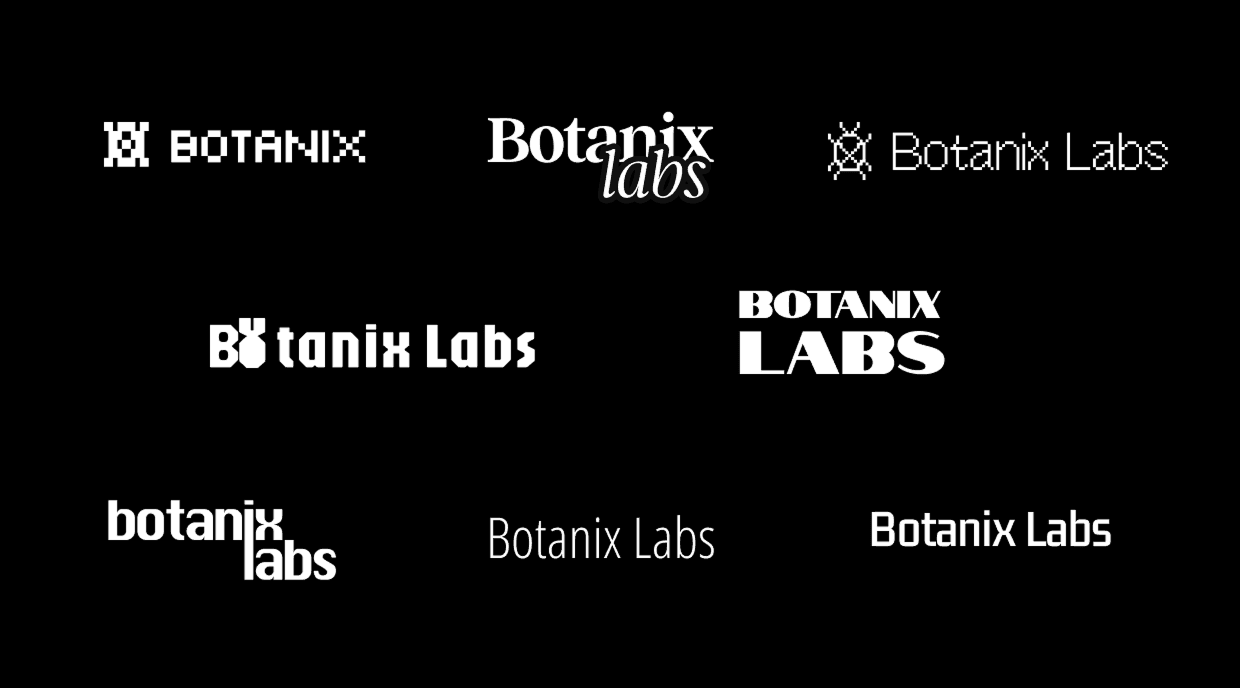
Initial Logo concepts and ideas.

Initial Logo concepts and ideas.


Geist does the heavy lifting on headlines and brand moments. Its geometry echoes the logomark's own symmetry without trying to match it exactly. Inter handles everything smaller: body copy, captions, interface labels, anywhere legibility matters more than personality. Between the two, nothing on the site is fighting for attention it doesn't need.

Yellow wasn't just a styling decision. It's a color Bitcoin already trained an entire generation to recognize on sight. We leaned into that instead of inventing something unfamiliar, then balanced it with a near black for contrast and a soft grey to keep the system from feeling one note. The result reads warm rather than loud, closer to a currency than a control panel.
Brand DNA // Research
We traced where those users usually give up: the point in most onboarding flows where a wallet connect screen or a gas fee explainer quietly ends the session. Botanix needed to clear that moment without pretending the underlying tech is simple. It just needed to stop sounding like a warning label.

Initial Logo concepts and ideas.

Initial Logo concepts and ideas.

Initial Logo concepts and ideas.
Brand Elements
Instead of illustrating a single idea, the pattern illustrates a network. Short parallel strokes stand in for individual operators. Where they angle and cluster, that's the network expanding as more of the Bitcoin economy plugs in. Spaced further apart, the same lines calm down into something closer to static, structural, load-bearing. It's one motif reading three different ways depending on how tightly the lines sit together.


Landing Page
A tighter, boxed layout came first: gridded sections with hard edges, closer to how most Bitcoin infrastructure sites present themselves. It read credible, but it also read closed, like a dashboard rather than a doorway. We rebuilt the header around the operator network pattern instead, letting it animate subtly behind the hero copy so the page felt alive without competing with "Welcome to the Bitcoin Economy" for attention. Below it, the Mainnet Live banner and the 2100 entry point sit inside that same yellow, the one consistent thread pulling every section back to the brand. Scroll behavior, hover states, and section transitions all carry a small amount of that same motion through the rest of the page, enough that the site itself feels like part of the network it's describing, not just a page about it.


Conclusion
Every piece ties back to the Spiderchain: the mark, the linework, the campaign built around 2100. None of it simplifies what Botanix actually does. It just refuses to explain it like a whitepaper. That was the brief, and it's the thing we kept coming back to whenever a direction started to feel too technical or too safe.
Conversion Rate
14.5x
Raised
$3.4M
Twitter Growth


