Bima

timeline
3 Months
Introduction
Most people want the benefits of cryptocurrency without the wild price swings, something as reliable as the dollar, but with the security and transparency that only Bitcoin can offer.

We designed BIMA to feel exactly like a stable, trustworthy bridge between traditional money and Bitcoin's revolutionary potential.
The Logo
We then discovered the boomerang. Unlike other symbols that felt either too technical or too generic, the boomerang perfectly captured BIMA’s essence: it always returns, just as BIMA’s stability brings you back to solid ground; it represents precision and trust, as a boomerang only works when crafted with perfect balance; and its reliable, predictable arc mirrors the stability BIMA provides.

Initial logo concepts & iterations
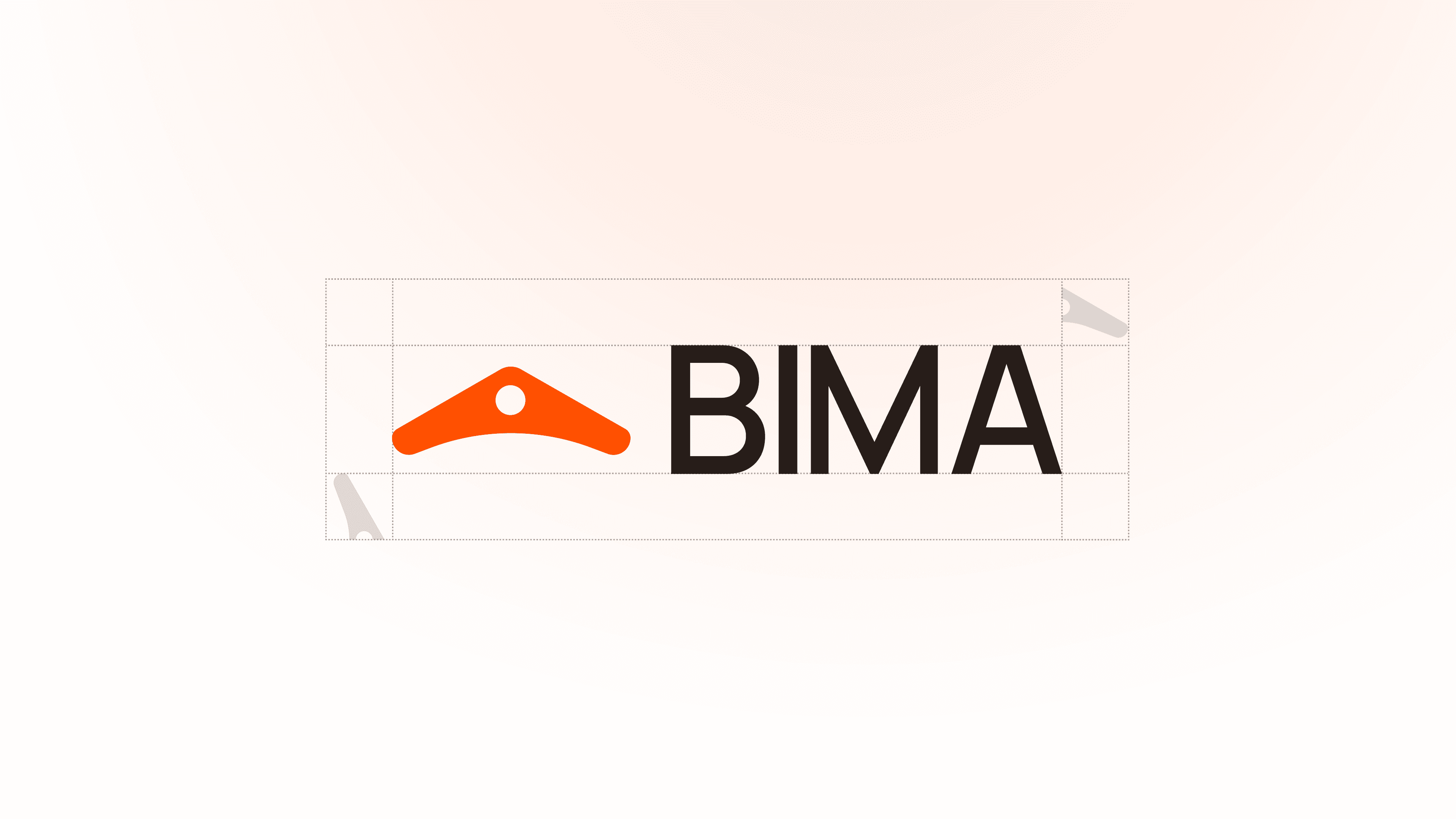
Initial logo concepts & iterations


We chose vibrant orange as our primary colour because it psychologically conveys warmth and trust essential for bridging the gap between intimidating DeFi complexity and human comfort.
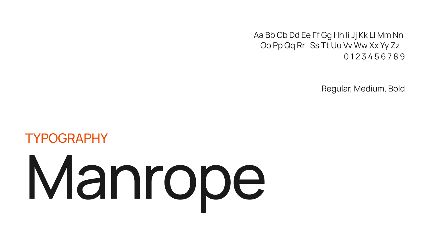
Manrope strikes the perfect balance between technical precision and approachability in letterform. Its clean, geometric structure communicates reliability, exactly what we wanted the brand to represent.

Brand DNA & Research
Through extensive research and competitor analysis, we discovered everyone was designing for crypto natives, but missing the broader market that wanted to unlock Bitcoin's potential. So we dived deep and developed BIMA's visual identity around three core principles: Warmth over intimidation: (Soft orange tones and gentle gradients instead of harsh elements) Clarity over complexity, and Trust through simplicity (Every element designed to feel reliable and accessible)

Initial logo concepts & iterations

Initial logo concepts & iterations

Initial logo concepts & iterations

Initial logo concepts & iterations
Brand Elements
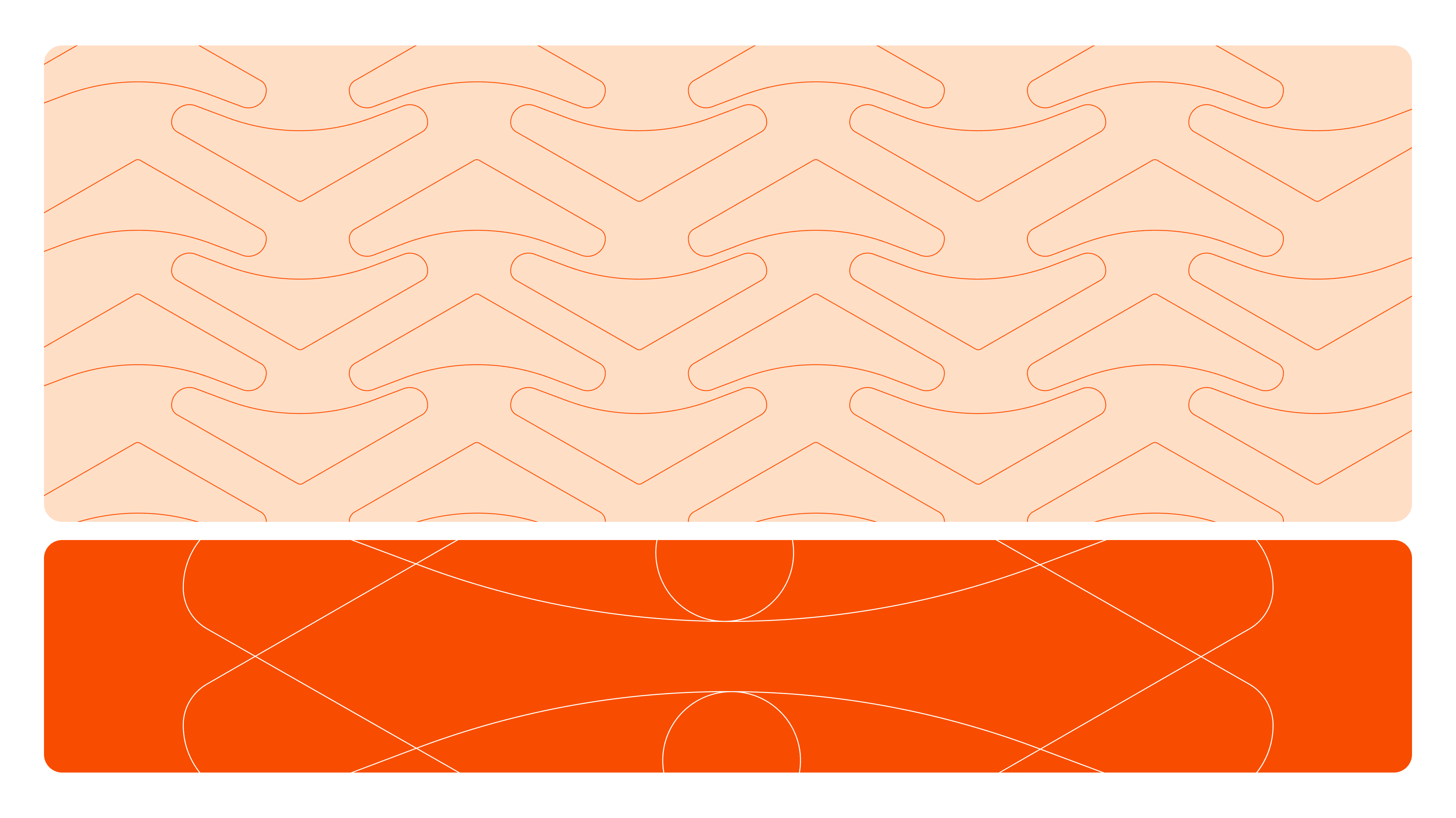
The logo is extended into a scalable 3D form that expands, and animates across surfaces. It functions as the structural anchor of the visual system rather than a static mark. All illustrations follow a rounded 3D style with controlled depth and soft gradients, avoiding an overly technical feel.Select rocket motifs are metaphors for forward momentum, balancing stability with growth. Together, the system translates Bitcoin-backed stability into a visual language that is structured, repeatable, and adaptable across ecosystems.




MASCOT
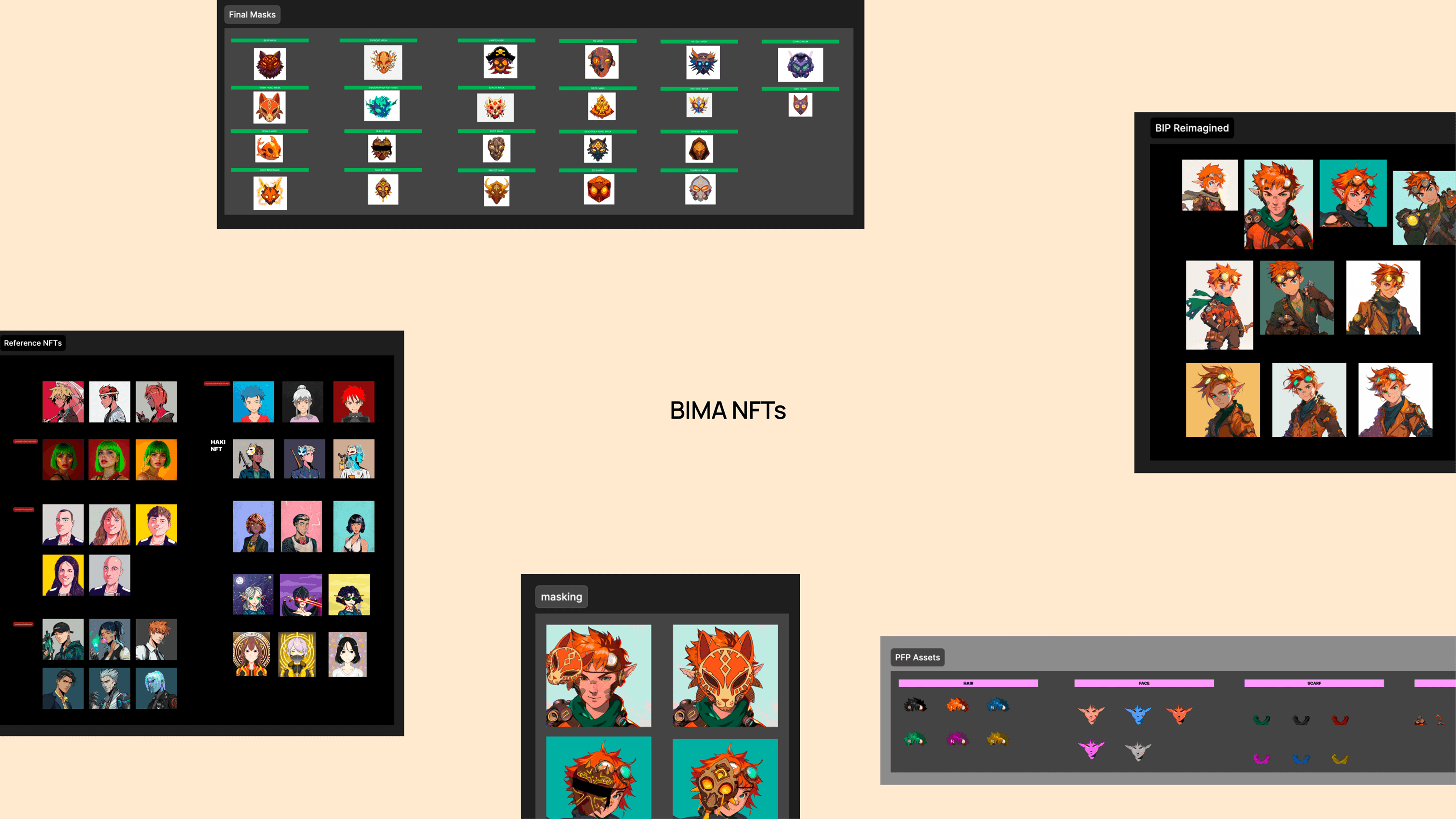
Inspired by Link, from The Legend of Zelda, we created a playful 3D elf who guides users through Bitcoin's world with childlike curiosity. His orange palette matches Bitcoin's signature colour, while his boomerang symbolizes the return nature of staking what you invest comes back with value. Through seasonal themes and action poses, the elf was designed to Bima’s core identity: a clever, trustworthy companion who makes Bitcoin staking feel less scary.

NFT PFP
We wanted to make the mascot as welll a part of the NFT adn that’s where the idea of using different masks on the mascot’s character for different NFTs came about. Each mask represents a pivotal event in Bitcoin's journey from the first transaction to major market shifts hand-drawn after careful AI exploration and ideation. These aren't just profile pictures; they're digital artifacts that let the community wear their Bitcoin heritage with pride.
Conversion Rate
14.5x
Raised
$3.4M
Twitter Growth


